Dorothy Draper and Hollywood Regency: bold colour and baroque scale


Dorothy Draper (1889–1969) was an American decorator who founded what is often called the first professional interior design company in the United States. Her most famous project is The Greenbrier, a grand resort hotel in White Sulphur Springs, West Virginia, which she redecorated after the Second World War in a riot of colour, pattern and oversized ornament.
Her style is usually filed under Hollywood Regency: a glamorous mid-century take on classical and Regency forms, with everything scaled up. Think black and white floors, huge plaster scrolls over doors, cabbage-rose chintz, glossy painted walls and bold stripes. The lesson for a home today is not to copy all of it, but to borrow her confidence with scale and colour.
Who was Dorothy Draper?
Draper was born into a wealthy family in Tuxedo Park, New York. She had no formal training. After decorating her own homes to great admiration, she set up her business in 1923, and soon she was decorating apartment lobbies, hotels and restaurants. In 1939 she published Decorating Is Fun!, a cheerful, practical book that encouraged ordinary readers to be brave with colour.
Her major commissions included the Hampshire House in New York, the Arrowhead Springs Hotel in California, the Quitandinha hotel in Petrópolis, Brazil, and the Dorotheum, a café she designed for the Metropolitan Museum of Art in the 1950s.
The Greenbrier
During the war The Greenbrier served as an army hospital. When it reopened in 1948, Draper had transformed its interiors. She used rhododendron-patterned fabrics, deep greens, pinks and reds, striped walls, black and white chequered floors and enormous gilded mirrors. Every room had a different scheme, but all shared the same energy. The hotel is still open, and its decoration has been maintained in her spirit by her successor, Carleton Varney, whose firm carried on her business.
Hollywood Regency explained
Hollywood Regency took its name from the glamorous houses and film sets of 1930s to 1950s Los Angeles. It borrowed from English Regency and French neoclassical design, then exaggerated it. Draper was one of its chief exponents, alongside the designer William Haines.
It is worth separating the two Regencies. English Regency, the style of John Nash and the Prince Regent, is light and refined, with slender furniture and delicate detail. Hollywood Regency keeps the classical shapes but blows them up for effect, like a stage set designed to be seen from the back row. Both share a love of symmetry, mirrors and clear colour, which is why they sit together more happily than you might expect.
- Baroque scale. Plaster scrolls, shells and pediments far larger than a period original.
- Bold colour. Strong greens, pinks, reds and turquoise, often glossy.
- Black and white. Chequered floors, lacquered doors and crisp contrast trim.
- Big pattern. Cabbage roses, wide stripes and oversized botanical prints.
- Shine. Mirrors, brass and gilding to bounce the light around.
The Draper lesson: if a detail is worth having, it is worth having big.
Plasterwork at full volume
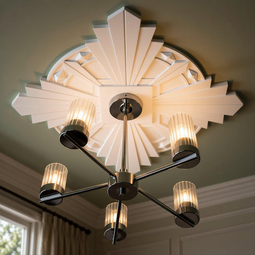
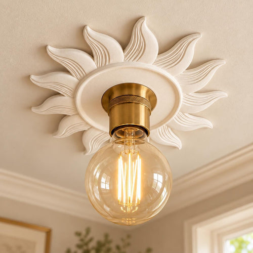
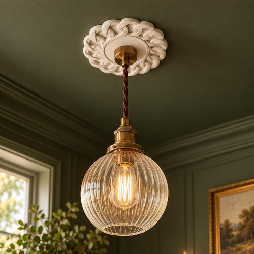
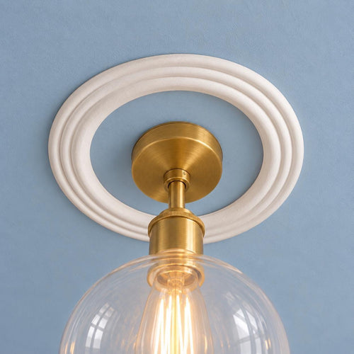
As a designer of plaster pieces, this is the part of Draper's work I love most. She used plaster architecture as a stage set. Plain doorways became events, topped with deep, carved overdoors. Fireplaces were framed with scrolls. Ceilings got large centrepieces that read from across a ballroom. The plasterwork was usually painted white or a single bright colour so its shape did the talking against strong walls.
The effect works because it is consistent. A single oversized piece in an otherwise timid room looks lost; several bold pieces in a confident scheme look intentional.
How to borrow the look
You do not need a hotel ballroom to use Draper's ideas. A hallway or dining room is the perfect place to try them, because people pass through and the drama does not have to be lived with all day.
- Go up a size. Choose a ceiling rose or overdoor a little larger than you think you need.
- Paint the walls, keep the plaster crisp. A strong green or pink wall with white plaster detail is pure Draper.
- Add contrast. A black door, black and white floor tiles or a black picture frame anchors the colour.
- Use one big pattern. A floral or striped wallpaper on one wall, not three.
- Bring in shine. A large mirror opposite a window or wall light.
Our overdoor pediments and ceiling roses are hand-cast to order in Shrewsbury and arrive as natural plaster, ready to paint with ordinary emulsion in whatever colour your scheme calls for. Start with the overdoors collection, and for more on using architectural detail in a passageway, read our guide to styling a hallway.
Good to know
Common questions
What is Hollywood Regency style?
Hollywood Regency is a glamorous mid-twentieth-century style named after 1930s to 1950s Los Angeles houses and film sets. It borrows English Regency and French neoclassical forms and exaggerates them, with bold colour, black and white contrast, mirrors, gilding and oversized plaster scrolls and pediments.
Who was Dorothy Draper?
Dorothy Draper (1889 to 1969) was an American decorator who set up her business in 1923 and helped professionalise interior design. She is best known for The Greenbrier resort in West Virginia and her 1939 book Decorating Is Fun!, which encouraged readers to be brave with colour.
What is the difference between Regency and Hollywood Regency?
English Regency, the style of John Nash and the Prince Regent, is light and refined, with slender furniture and delicate detail. Hollywood Regency keeps the classical shapes but scales them up for drama. Both share symmetry, mirrors and clear colour.
Sources
References and further reading
Harvard style. Web pages were checked on the access date shown.
- Draper, D. (1939) Decorating Is Fun! How to Be Your Own Decorator. New York: Doubleday, Doran.
- Varney, C. (1988) The Draper Touch: The High Life & High Style of Dorothy Draper. New York: Prentice Hall Press.
- Albrecht, D. (2006) The High Style of Dorothy Draper. New York: Pointed Leaf Press.
- The Greenbrier (n.d.) History. Available at: www.greenbrier.com/history (Accessed: 8 October 2026).
How to cite this article
van Locke, J. (2026) ‘Dorothy Draper and Hollywood Regency: bold colour and baroque scale’, The Flare Journal. Flare Studio UK. Available at: https://flarestudio.uk/blogs/journal/dorothy-draper-hollywood-regency (Accessed: 12 October 2026).
Shop the style