

The Best Warm White Paint Colours in the UK

What "warm white" actually means
A warm white is a white with a little yellow, red or brown in it, so that it looks soft instead of clinical. The paint makers use the idea loosely. Farrow & Ball describes Wimborne White (No. 239) as a "just off white" that is "only a shade away from a pure white", with "the smallest amount of warm yellow pigment" making it versatile and a little softer than its All White.[1] Dulux files Natural Calico under "Warm Neutral" on its colour page.[2] Those are descriptions, not measurements. This guide adds a measurement that you can compare: the Light Reflectance Value, or LRV.
We read the pages of the makers we could reach and report only what they say. We do not pick favourites from memory, and we name colours only where we have read the maker's own page. Where a maker does not publish LRV on the page, we say so.
LRV in plain English
LRV is the percentage of visible light a surface reflects. Dulux Trade describes it as a 99-point index: the higher the LRV, the more light the colour reflects and the paler it appears.[3] Crown gives an example from its commercial colour book: a colour that reflects 83% of light has an LRV of 83, and in its SCAN code system the middle two digits of the code show the LRV.[4] That is why Cream White B7870M reads as 87: "B7 87 0M".[5]
Why does it matter for a warm white? Because two whites with the same name-family can differ by 20 points of brightness, and a dim room needs the brighter one. Little Greene says each of its colours has an LRV, advises higher-LRV shades for walls that get less natural light, and names Loft White at LRV 92 as a space-expanding white.[6] Oberfeld and Hecht (2011) found in virtual-room tests that lighter ceilings and walls make a room look taller, though not wider.[7] So brightness is the first filter. Warmth is the second.
The data: twelve Crown whites ranked by LRV
Crown Paints Professional publishes the LRV in a "Technical Details" table on every swatch page we opened. The chart shows twelve colours from its Fandeck and Colour Edit ranges that Crown files as White. They run from 87 (Cream White) to 67 (Smoked Glass).[5]
Three things stand out. First, the spread is large: 20 points separate the brightest from the darkest. Second, the word "white" is a family label, not a brightness guarantee: Smoked Glass is filed under White at LRV 67, which is darker than many creams. Third, the warm ones we read cluster between 76 and 87. In our rule of thumb, that is the safe zone for living rooms: bright enough to feel clean, soft enough to avoid glare.
The warm white map plots the same colours against the yellowness of the on-screen colour Crown publishes (our calculation of CIELAB b* from the sRGB values on each swatch page). The creamier colours, such as Cream White, Summer White and Parsonage Cream, sit higher. Clay White, Fresh Coconut, Seldom Seen and Pine Frost sit near the bottom: on screen they are neutral or slightly cool, so a name in the white family does not guarantee warmth either. If you want warm, pick from the top of the map. Screens vary, so treat the map as a way to rank, not as a colour match.
Colour names that give you something to test
If you want brand-name starting points, these are the ones we could verify from the makers' own pages:
- Crown: Cream White (B7870M, LRV 87), Sail White (C3840E, 84), Summer White (B6820K, 82), Beige White (B4810H, 81) and Parsonage Cream (B8770Q, 77) from the Fandeck; Swiss Coffee (76) and Victoria White (76) from Colour Edit, plus Clay White (83), Fresh Coconut (83), Seldom Seen (78) and Pine Frost (72), which read as neutral or cool on screen and are not warm whites.[5]
- Farrow & Ball: Wimborne White (No. 239), described as a just off white with warm yellow pigment. The page lists All White (No. 2005), Wevet (No. 273), Pointing (No. 2003) and School House White (No. 291) as colours to compare, but gives no LRV.[1]
- Dulux: Natural Calico, in the Warm Neutral family; the colour page gives no LRV.[2]
- Little Greene: Loft White at LRV 92 is the one colour whose value we read on its advice page.[6]
We have not listed other makers' colours because we could not read their pages. For those, ask the maker for the LRV, which is a standard datum, or check the back of the colour card.
Choosing by room and light
North-facing and shaded rooms. Go to the brighter end, LRV 83 and above, and a cleaner, less yellow white. Little Greene's advice is to choose higher-LRV shades for walls that get less natural light.[6] Our guide to paint colours for north, south, east and west facing rooms explains why north light makes colours look cooler.
South-facing rooms with a lot of glass. You can go softer, LRV 75 to 80 (our rule of thumb), because the room is bright anyway and softer colours are easier on the eye.
Small rooms. Farrow & Ball says to avoid crisp white in small spaces and to use an off-white as a softer, more interesting alternative that still reflects light.[8] Our guide on making a small room look bigger has the evidence.
Rooms you use mostly in the evening. Check the paint under your evening bulbs. The Energy Saving Trust describes about 2700 K as very warm white for living areas and 2700 to 3000 K as warm white for most household lighting.[9] A cool 4000 K bulb on a warm white wall flattens the warmth you paid for.
The ceiling and the trim
Keep the ceiling the brightest surface in the room, or at worst equal to the walls. Oberfeld and Hecht found that a light ceiling made rooms look taller, and that the effect of ceiling and wall lightness was additive, not a matter of contrast between them.[7] A ceiling a few LRV points brighter than the walls is a good default. For trim, one or two points below the walls gives a quiet, continuous look; ten or more gives crisp definition.
Sheen changes how a colour looks. Farrow & Ball lists its range from Dead Flat at 2% to Full Gloss at 95%, says that higher sheen reflects more light and shows imperfections more, and that colours often look darker in higher sheen finishes, especially colours that are already dark.[10] For walls, a matt or low-sheen finish is the usual choice; our guide to paint finishes, room by room goes through each.
A worked example
Take a 4.0 m × 4.0 m north-facing living room with a single window and a wood floor. It is bright enough in the day but cool and shadowy in the evening. Our pick from the Crown data: Cream White (LRV 87) on the ceiling, Summer White (LRV 82) on the walls and Beige White (LRV 81) on the trim.[5] The ceiling is five points brighter than the walls, so it quietly lifts; the trim is one point below the walls, so the room reads as continuous. Add 2700 K bulbs and the room feels warm without being dark.[9]
If you want more definition, swap the walls for Parsonage Cream (LRV 77): the ceiling is then 10 points brighter, which gives a clearer edge and a creamier feel at the cost of five points of light.[5] That is a trade-off, not a mistake: choose by what you want the room to do.
Our guide to the 60-30-10 rule shows how to add accent colours, and the colour drenching guide shows the opposite approach.
Contrast and accessibility
Whites differ little in LRV, so a white wall and a white door give almost no contrast. Crown's commercial colour book says adjacent colours should ideally differ by more than 30 LRV points, and that in areas with more than 200 lux a minimum difference of 20 points should suffice.[4] If anyone in the home has sight loss, choose a deeper door or handrail colour with that gap. For ordinary all-white schemes, the numbers say there will be no contrast between neighbours, which is the point.
Older paint and lead
If your home was decorated before the 1980s, assume old layers may contain lead. The Health and Safety Executive says lead pigments were widely used in paints for homes until the 1960s and were not removed from all commonly used paint until the early 1980s. It advises leaving sound paintwork in place, stripping only where paint is flaking, chipping or dusty, using wet abrasive paper, and keeping children and pregnant women away from the work area.[13] The National Trust notes that lead white, used since 400 BC, was restricted because of its toxicity.[11] Test before you sand, and follow the HSE guidance for any work that disturbs it.
Common mistakes
- Judging from a tiny swatch. Use large patches.
- Ignoring the bulbs. Warm paint under cool light looks cold.[9]
- Assuming white means bright. Smoked Glass is a Crown White at LRV 67.[5]
- White trim on cream walls by default. Match it to the wall within a few LRV points if you want a soft look.
- Using high gloss on walls. It shows every flaw.[10]
- Sanding old paint dry. It may contain lead.[13]
What to do next
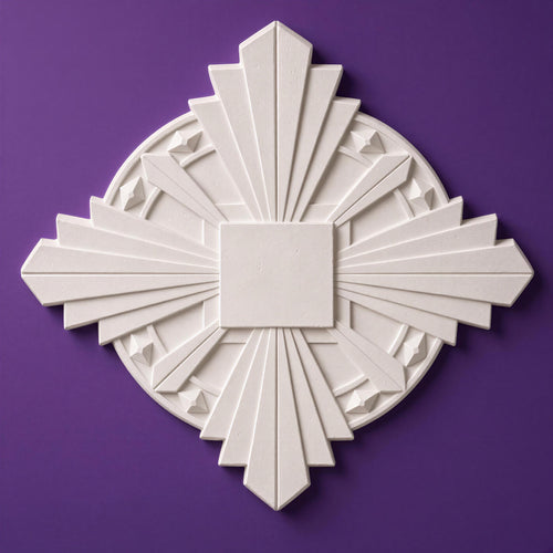
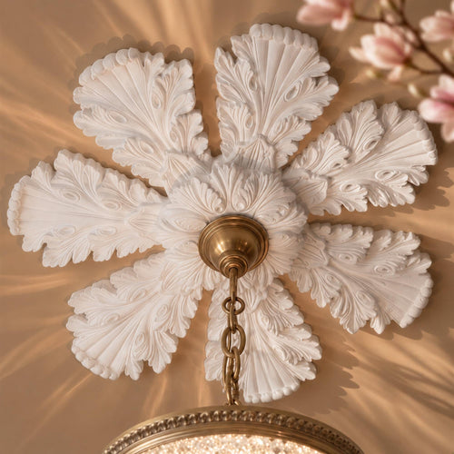
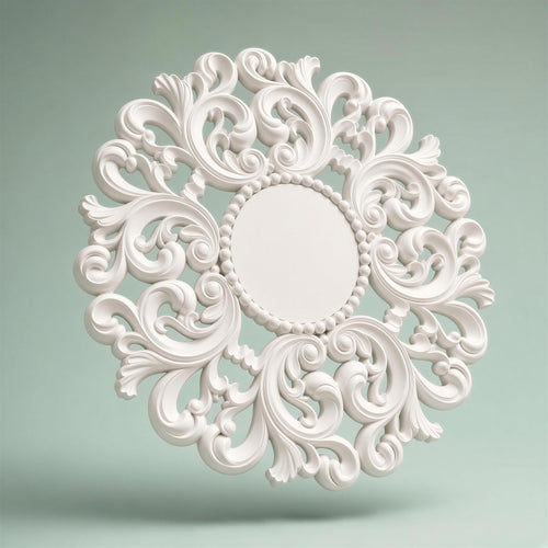
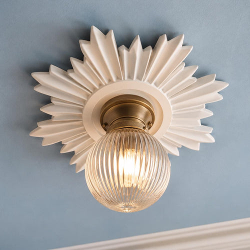
Pick two or three colours from the LRV band that suits your light, buy samples and test them for a day. Then match the ceiling, trim and bulbs. Our plaster ceiling roses, wall lights and overdoor pediments are supplied unpainted and paint well in any of these whites, which is why we keep a note of LRV when we match them to a scheme.
Keep reading
- Paint colours for north, south, east and west facing rooms
- The 60-30-10 rule
- Paint finishes: matt, eggshell, satin, gloss
- Syrie Maugham and white on white interiors
- Cosy winter living room ideas
- How to make a small room look bigger
Shop the look


Frequently asked questions
What is the best warm white paint colour in the UK?
There is no single best, because it depends on your light. We list twelve Crown whites with their LRV from 87 down to 67, plus Farrow & Ball Wimborne White and Dulux Natural Calico. For a dim room choose LRV 83 or above; for a bright room 75 to 80 is easier on the eye.
What does LRV mean on paint?
Light Reflectance Value: the percentage of visible light a colour reflects, on a scale where higher is brighter. Dulux Trade calls it a 99-point index; Crown gives Cream White B7870M an LRV of 87.
Is a warm white better than a cool white?
Warm whites suit most British homes because they soften the grey light and flatter wood and fabrics. Cool whites suit very bright, south-facing rooms or modern schemes. Test both under your bulbs.
What LRV should I choose for a north-facing room?
Little Greene advises higher-LRV shades for walls with less natural light. As our rule of thumb, aim for 83 or above and a cleaner white rather than a creamy one.
Do white paints with the same LRV look the same?
No. LRV measures brightness, not undertone. Two whites at the same LRV can be creamier or cleaner, which is why we plot yellowness against LRV in the map.
Should ceiling and walls be the same white?
You can paint them the same, but a ceiling a few LRV points brighter than the walls is a good default. A study found light ceilings and walls make a room look taller, with additive effects.
What finish should I use with a warm white?
Matt or low-sheen on walls and ceilings, eggshell on woodwork. Farrow & Ball says higher sheens reflect more light and show imperfections more.
Could old paint in my house contain lead?
If it was painted before the 1980s, it might. The HSE says lead pigments were widely used until the 1960s and not removed from all commonly used paint until the early 1980s. Leave sound paint alone and follow HSE precautions before disturbing it.
Sources
References and further reading
Harvard style. Web pages were checked on the access date shown.
- Farrow & Ball (n.d.) Wimborne White No. 239. Available at: www.farrow-ball.com/paint-colours/wimborne-white (Accessed: 27 October 2026).
- Dulux (n.d.) Natural Calico: warm neutral paint colour. Available at: www.dulux.co.uk/en/colour-details/natural-calico (Accessed: 27 October 2026).
- Dulux Trade (n.d.) Colour in construction. Available at: www.duluxtradepaintexpert.co.uk/colour-in-construction (Accessed: 27 October 2026).
- Crown Paints (n.d.) Crown Trade commercial colour book, page 5: Light Reflectance Value and colour contrast. Available at: online.flippingbook.com/view/385059025/5 (Accessed: 27 October 2026).
- Crown Paints Professional (n.d.) Cream White (B7870M): colour swatch with technical details including Light Reflectance Value. Other white and neutral swatches on the same site were read individually (Sail White C3840E, Summer White B6820K, Beige White B4810H, Parsonage Cream B8770Q, Clay White, Fresh Coconut, Seldom Seen, Swiss Coffee, Victoria White, Pine Frost, Smoked Glass B7670E). Available at: professional.crownpaints.com/colour/swatch/b7870m/ (Accessed: 27 October 2026).
- Little Greene (n.d.) How to make rooms feel bigger with paint and wallpaper. Available at: www.littlegreene.com/advice-hub/how-to-make-rooms-look-la... (Accessed: 27 October 2026).
- Oberfeld, D. and Hecht, H. (2011) Fashion versus perception: the impact of surface lightness on the perceived dimensions of interior space. Human Factors, 53(3), pp. 284-298. doi:10.1177/0018720811407331. Available at: www.staff.uni-mainz.de/oberfeld/downloads/oberfeld_hecht_... (Accessed: 27 October 2026).
- Farrow & Ball (n.d.) How to paint your smallest spaces. Available at: www.farrow-ball.com/how-to-guide/paint/decorate-your-smal... (Accessed: 27 October 2026).
- Energy Saving Trust (n.d.) Lighting. Available at: energysavingtrust.org.uk/advice/lighting/ (Accessed: 27 October 2026).
- Farrow & Ball (n.d.) Understanding paint sheen. Available at: www.farrow-ball.com/paint/applications/sheen-levels-expla... (Accessed: 27 October 2026).
- National Trust (2019) History of paint at the places in our care (adapted from the National Trust Magazine, Autumn 2019). Available at: nationaltrust.org.uk/discover/history/art-collections/his... (Accessed: 27 October 2026).
- Bulmer, E. (2016) Colour in Georgian interiors. Building Conservation Directory. Available at: buildingconservation.com/articles/georgian-interiors-colo... (Accessed: 27 October 2026).
- Health and Safety Executive (n.d.) Lead: hazardous substances in construction. Available at: www.hse.gov.uk/construction/healthrisks/hazardous-substan... (Accessed: 27 October 2026).
How to cite this article
Tire, G. (2026) ‘The Best Warm White Paint Colours in the UK’, The Flare Journal. Flare Studio UK. Available at: https://flarestudio.uk/blogs/journal/best-warm-white-paint-colours-uk (Accessed: 12 November 2026).
Shop the style





Conversation
Join the conversation
Questions about the history, a room you are planning, or a piece you have seen in the wild? Leave a comment and Joseph will reply.